the brushes i use in clip studio paint ex
I create all of my digital art in Clip Studio Paint EX v1.13.2.
Most brushes I use are default brushes. I provide links to everything that is from a custom set.
| Stage of Process | Brush | Link to Brush Set |
|---|---|---|
| Sketch | Mechanical Pencil | N/A, Default Brush |
| Line Art |
G-Pen | N/A, Default Brush |
| Base Colors | Oil Paint Brush Lasso Tool |
N/A, Default Brushes |
| Shading (Comic) | G-Pen Blur Tool |
N/A, Default Brushes |
| Shading (Color Work) | Dense Watercolor Soft Airbrush Blur Tool |
N/A, Default Brushes |
| Default Other (atmospheric effects in the webtoon, etc.) | Gauze Cloud Airbrush Droplet Gradient Watercolor |
N/A, Default Brushes |
| Non-Default Other (atmospheric effects in the webtoon, etc.) | Reflected Light |
Light effect brushes |
| Glitch Bars | Glitch brushes |
I keep the number of brushes I use in the webtoon fairly limited, in order to…
Develop a sense of uniformity
Push the limits of my style, in the face of this restriction
That said, this is ultimately a personal decision. One can achieve uniformity with a larger set of brushes, and one can push themselves, regardless of specific restrictions. I’ll likely change my methods as the story continues, too. I share this information just to give personal insight, not to instruct anyone on how to create.
The rest of this post discusses how I use some of these brushes.
G-Pen for Line Art
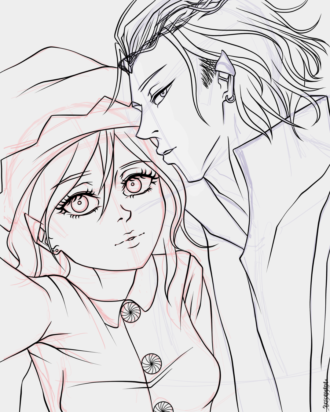
Featuring Isa and Nao as elves :P
I do my line art at around ~20% Stabilization and with a brush size that is slightly larger than the line width I actually want to appear on the canvas. Given my combo of hardware settings (pen sensitivity and IAF specs), software settings (stabilization and pressure settings through Clip Studio Paint), and my personal drawing style, the look of my line art is achieved through a generally light application with varied pressure for different line thicknesses.
I use ~20% Stabilization because it works well with my lining speed and cleans up some of the tapers at the ends of my lines.
Oil Paint and Lasso Tool for Base Colors
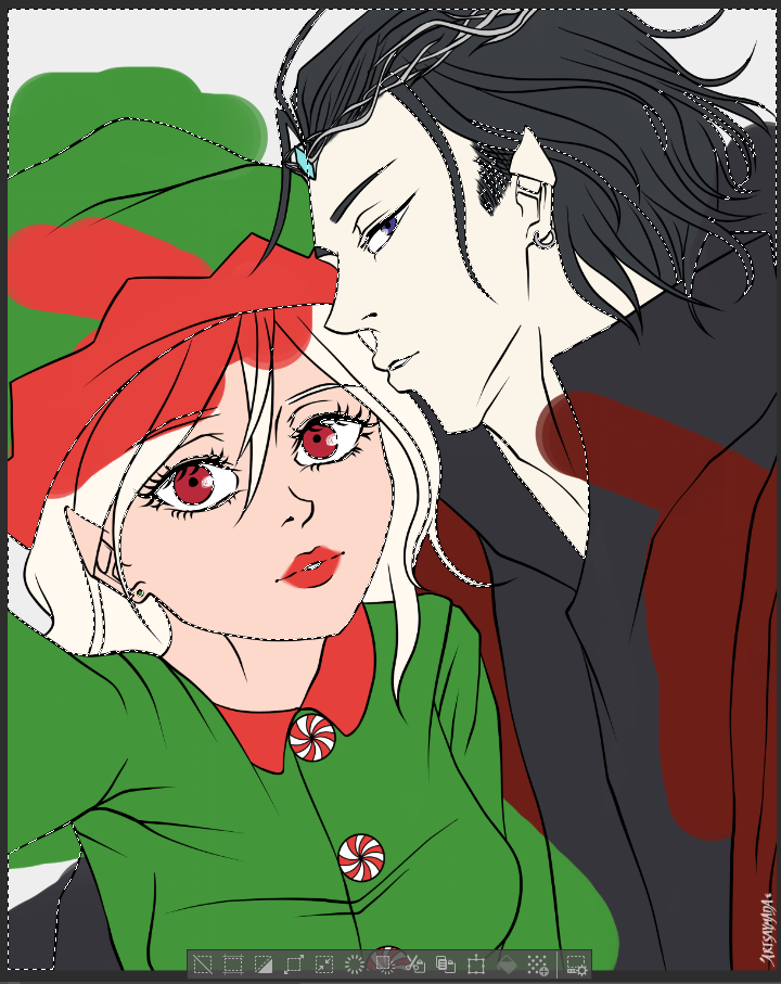
Maximum Chaos
To more efficiently apply base colors, I actually recommend using the Lasso Fill tool (under “Figure” tools, shortcut ‘U’).
That said, I like the chaotic vibe of scribbling across my canvas with the Oil Paint brush, then erasing with either the Lasso Tool or Transparent Paint Bucket, as shown :P
To clarify, I do each base color on its own layer. The image depicts multiple scribbled base colors (for maximum chaos), but in practice, I normally clean up one base color layer before I move onto creating the next.
G-Pen + Blur Tool for Shading (Comic)
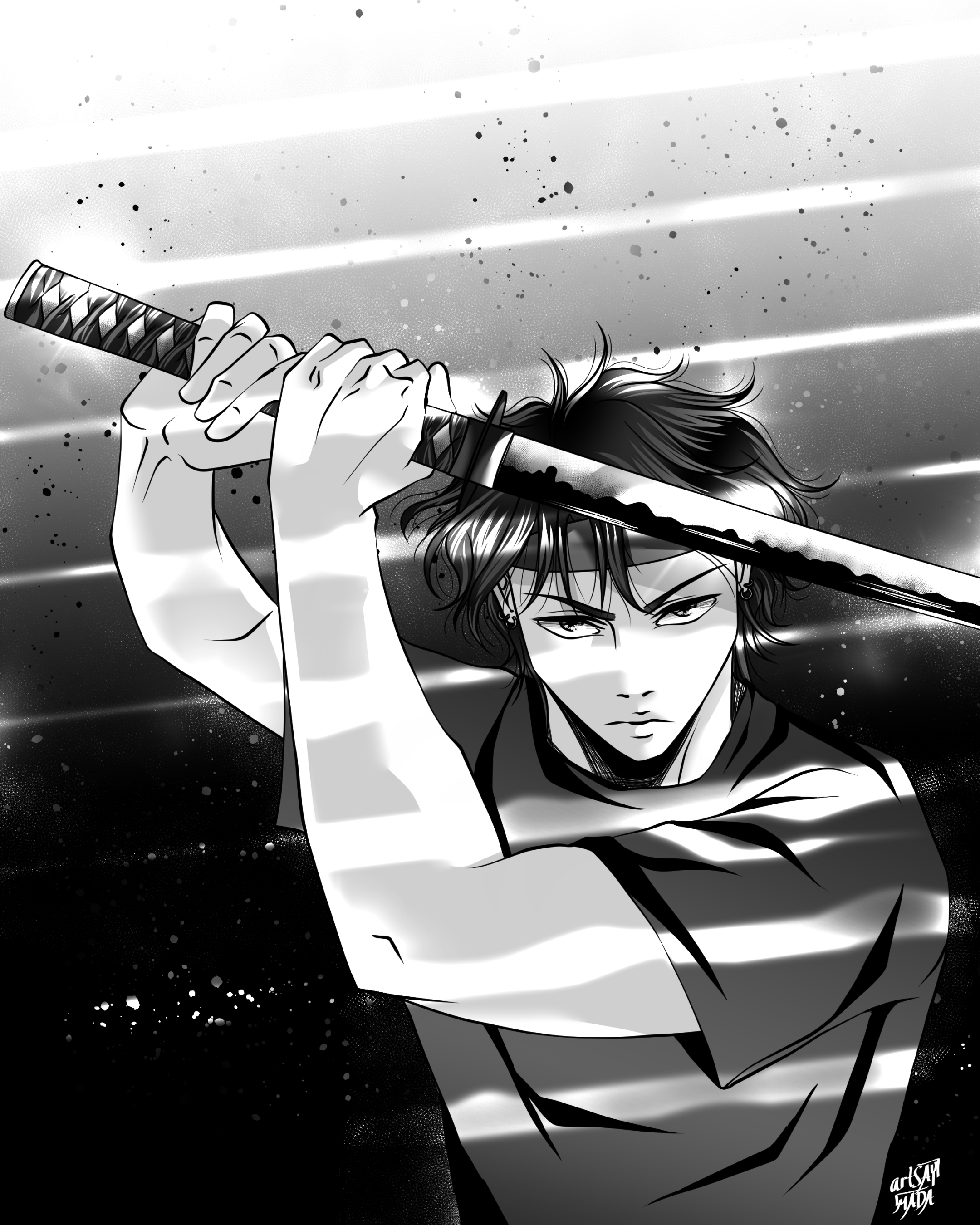
Koji in PH3
I try not to use more than 1 cel shading layer. I may use gradients and other textures on a base, but I’ll limit the cel shading to just 1, unless I really feel the need to add dimension with more. In the above example, there is a gradient on Koji’s shirt (and strips of light from the environment), but the only execution of cel shading on his shirt is the 1 layer of black “ink”.
I use the G-Pen to do this for uniformity with my line work and because I like the bold look it creates.
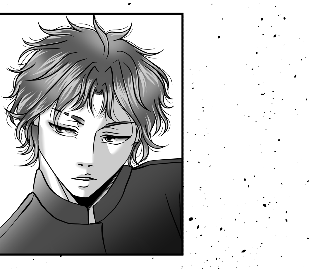
Cane in PH3
Given the limited number of cel shading layers, I will often use the Blur tool to add more dimension to a single layer and convey a shadow’s distance from what’s casting it. This can be seen in the gray shading layer used for Cane’s skin.
All that said, how I shade depends on
what I’m shading (an environment, a character’s skin, hair, etc.) and
my intentions for the scene (the intensity, how much of the reader’s attention I’m trying to capture in a particular panel, etc.).
Even in the above example, I used 2 shading layers for Cane’s skin, instead of 1. The second layer is the black ink to convey an under-neck shadow, and I included it simply because it emulates a look from manga that I like. My general guidelines are meant to be visual anchors, not hard rules that I can never break.
Dense Watercolor, Soft Airbrush, and Blur Tool for Shading (Color)
No pun intended, but my color art is typically not as “edgy” as my comic art :)
Koji and Cane, Unblended
I love the look and versatility of the Dense Watercolor brush. It creates a looser, more painterly look than what my comic brushes convey, but it can still realize harder edges when needed.
How I color and use blending layers in CSP can be its own discussion entirely, but I will say here, I like having a lot of contrast in my art. Before I use the Blur tool to soften edges in the Dense Watercolor brushstrokes, I’ll also use the Soft Airbrush to “bridge the gap” between values where I feel it’s needed.
And… We’re done!
Here is how my color artworks look after using the Blur tool on the Dense Watercolor layers (and a few other rendering steps lol). As you can see, I don’t blend out all the hard edges, just where I think it makes sense to.
I still have quite a bit to learn about lighting and edge control, but I’m glad these brushes are a part of my journey.